Wendy’s Branding Catastrophe: How the New Blue Makeover Risks Killing Appetite and Loyalty
Wendy’s long revered for its iconic red branding and warm, hunger-inducing visuals, has undertaken a radical and potentially disastrous color shift. With the rollout of the “Future Fresh” initiative, global franchises are trading in familiar reds for cold, pale blues. While executives hail this as modern and digitally forward, the reality is that this aesthetic gamble could alienate core customers, suppress appetite, and destabilize decades of brand equity.
The Digital-First Illusion
Alongside the color overhaul, Wendy’s is emphasizing ordering kiosks, loyalty programs, and digital-first layouts. However, modern features cannot overcome an unappetizing visual environment. Customers may enter expecting warmth and excitement but encounter a space that subconsciously signals restraint and detachment, dulling their engagement and willingness to spend.
The sterile blue can psychologically prime customers to consume less, potentially eroding average ticket values. Even with seamless digital ordering, the loss of primal appetite undermines the overall strategy.
Cultural and Global Risks
The blue aesthetic debuted in the Philippines but is slated for worldwide implementation. Color perception is deeply cultural blue may resonate in some markets as premium or clean, but in others, it signals coldness, distance, or a lack of urgency. This inconsistency risks fracturing brand identity across regions, leaving Wendy’s visually disjointed and weakening global recognition.
Alienating the Core Customer
Wendy’s loyal base expects warmth, boldness, and familiarity. The sudden shift to a pale, cold blue may feel alienating, eroding customer satisfaction, and diminishing brand trust. Long-time patrons may feel that the chain has abandoned the brand personality they love, while new customers may struggle to form an emotional connection.
The Risk of Social Backlash
Social media will amplify dissatisfaction. Memes, criticism, and negative press already spread rapidly when beloved brands tamper with recognizable identities. Wendy’s may face public backlash, viral criticism, and a perception of “losing its soul” before the redesign even reaches full global rollout.
A Risky Differentiation Gamble
Ken Cook, CFO, positions the move as a way to differentiate from competitors. Yet differentiation that erodes emotional and sensory drivers is a double-edged sword. True innovation preserves psychological cues while modernizing aesthetics. By abandoning red entirely, Wendy’s risks alienating, confusing, and suppressing appetite simultaneously, a perilous combination.
Blue Over Red: A Psychological Misfire
Color psychology is a critical driver in fast-food engagement, not an aesthetic afterthought. Red stimulates hunger, urgency, and impulse decisions, key levers for high-volume QSR success. Blue, in contrast, conveys calm, coolness, and in some cases, detachment. In a dining context, these cues suppress appetite and discourage spontaneous ordering.
Research shows that diners subconsciously respond to the colors of their surroundings. The new blue interiors could inadvertently signal restraint and reduce the subconscious craving cues that drive snack sales, combo upsells, and dessert orders. The stark shift is not just visually jarring it, undermines the primal instinct Wendy’s has leveraged for decades.
Iconic Identity in Crisis
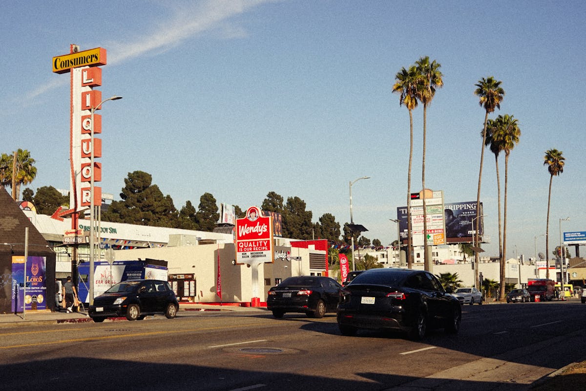
Wendy’s has built a brand around warmth, nostalgia, and recognizability. The red palette is inseparable from its mascot, signage, and logo recognition. By abandoning these cues, Wendy’s risks creating a cognitive disconnect, customers may not immediately recognize the brand, reducing foot traffic and loyalty.
Competitors like McDonald’s and KFC continue to rely on color-driven appetite triggers, making Wendy’s new look feel cold, sterile, and uninviting by comparison. The move may create differentiation, but it comes at the expense of intuitive, emotional branding that has historically driven customer retention.
Appetite Suppression and Financial Consequences
The practical ramifications are alarming. Fast food relies on quick, high-volume decision-making. Red interiors, signage, and packaging encourage impulse ordering and repeated visits. Blue interiors, by contrast, are psychologically unappetizing, discouraging repeat orders, and potentially lowering overall revenue.
Luxury QSR experiments have shown that subtle environmental cues—from lighting to color—directly influence customer behavior. Wendy’s risks dampen the very instincts that made the chain profitable, creating long-term financial implications.