Did the Laughing Cow Stop Smiling? The Cheese Packaging Mystery Explained
If the cow on your cheese suddenly looks less cheerful, you may not be imagining the difference, but the story behind that familiar face is more interesting than a simple packaging change.
Few food packages are as recognizable as The Laughing Cow. The red cow, round ears, and unmistakably cheerful expression have been staring back from cheese boxes for generations. So when people notice the cow looks different—or even claim she’s stopped smiling, it can feel strangely unsettling.
But before blaming a packaging redesign, there is a bigger story here. The Laughing Cow has changed its artwork several times during its long history, while keeping the character recognizable. That makes the brand a fascinating example of how a tiny change in a familiar food package can suddenly become very noticeable.
The Cow Has Been Around for More Than a Century
The smile is not a recent marketing trick—it is part of the brand’s original identity.
The Laughing Cow was created in France in the early 1920s by Léon Bel, who wanted a way to sell processed cheese in convenient individual portions. Bel registered the trademark in 1921, and illustrator Benjamin Rabier’s famous red cow began appearing on the packaging in the 1920s. The brand’s own history of The Laughing Cow explains that Rabier’s emblem appeared in 1924 and that Mrs. Bel added the famous cheese-box earrings at her request.
That means the cheerful expression is not merely decoration. It is one of the visual features that helped turn a simple cheese product into a character people could recognize from across a shop.
And that character has survived an extraordinary number of packaging changes.
Yes, Her Face Has Changed Before
The Laughing Cow you remember from childhood may not look exactly like the one on today’s box.
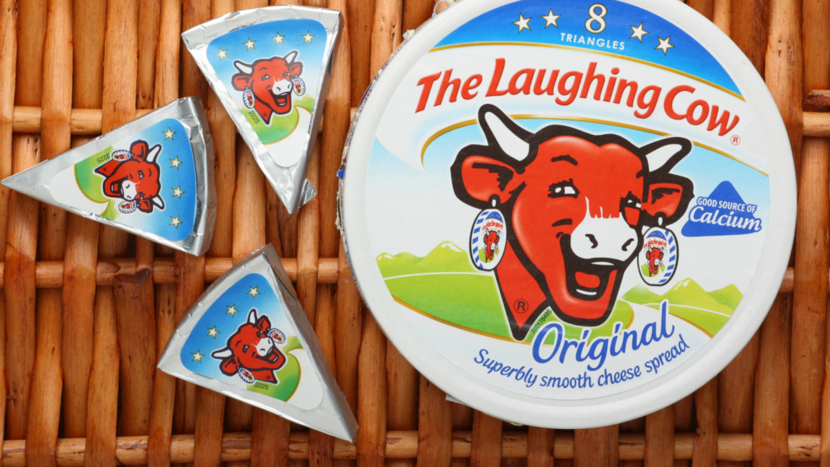
Packaging naturally evolves as printing techniques, advertising styles, and consumer tastes change. A particularly significant redesign came in 1971, when the cow took on a simpler, more dynamic look. The World Intellectual Property Organization’s history of the design notes that the redesign shortened and rounded the horns, simplified the details, and placed the cow inside a bold triangular frame inspired by the cheese portions.
So if an older package looks different from a newer one, there is a genuine historical reason.
The interesting part is that the brand has generally preserved what people immediately associate with her: the red face, the earrings, the playful expression, and the circular packaging format.
Why Does She Suddenly Look Less Happy?
Sometimes the biggest packaging mystery is not what changed, but what your eyes expect to see.
When you have seen the same mascot thousands of times, your brain does not necessarily examine every detail each time you look at it. You recognize the overall shape and fill in the familiar details almost automatically. A slightly different angle, crop, print quality, or facial line can therefore make the same character appear surprisingly different.
There is also a genuine history of subtle adjustments. A packaging-design case study found that a 2020 global refresh tilted the cow’s head and broadened her smile to emphasize happiness. That means even the smile itself has been deliberately adjusted before.
So the idea that the cow has never changed is not quite right.
Those Famous Earrings Are More Than Decoration
The little circles hanging from her ears are one of the cleverest details on the entire package.
They represent miniature cheese boxes, and inside those boxes is another image of the cow wearing the same earrings. The result is a visual loop that can keep repeating inward—a classic example of the Droste effect.
It is an unusually clever piece of food packaging because the product essentially advertises itself. The cheese boxes become earrings, the earrings contain cheese boxes, and the cow appears again inside them.
The design also helped make the character instantly recognizable. The French cultural heritage database’s record of the original artwork identifies Benjamin Rabier as the artist behind the famous La Vache qui rit poster from the early 20th century.
The Cheese Has Changed, But the Character Remains
That may be why a small change to the cow’s expression feels so noticeable.
The Laughing Cow was never just a picture printed on a cheese box. From its earliest years, Bel deliberately used the character to give the product personality and build a relationship with consumers. The company promoted the mascot through posters, advertisements, and children’s items long before today’s social-media branding existed.
That helps explain why people can become surprisingly attached to the exact expression they remember.
For anyone who enjoys discovering familiar foods that make everyday meals more interesting, The Laughing Cow reminds us that food memories are often tied to much more than taste. Sometimes it is the package, the color, the character, or even the face staring back from the refrigerator.
And when you want to make everyday routines feel a little less predictable, simple kitchen habits can do the same: small details can become surprisingly memorable.
The next time you unwrap one of those familiar cheese portions, take a second look at the cow. She may look slightly different from the one you remember, but her long-running identity is still right there on the package.
Do you remember The Laughing Cow looking different when you were younger, or has her familiar smile always looked the same to you?