8 Vintage Food Packages That Look Nothing Like Today’s Versions
Remember when grocery store shelves were filled with colorful cardboard boxes, glass bottles, and food packages decorated with charming illustrations? Long before today’s sleek logos and modern packaging, America’s favorite food brands looked surprisingly different. Some products came in containers that younger shoppers might barely recognize.
From Oreo cookies sold in metal tins to ketchup packaged in old-fashioned glass bottles, these familiar products have undergone remarkable transformations. Some changes improved convenience, while others helped brands attract new generations of customers. Yet looking at their original packaging reveals just how much American grocery shopping has changed.
Here are eight vintage food packages that show even the most recognizable grocery brands once looked completely different.
Oreo Cookies Once Came in Metal Tins
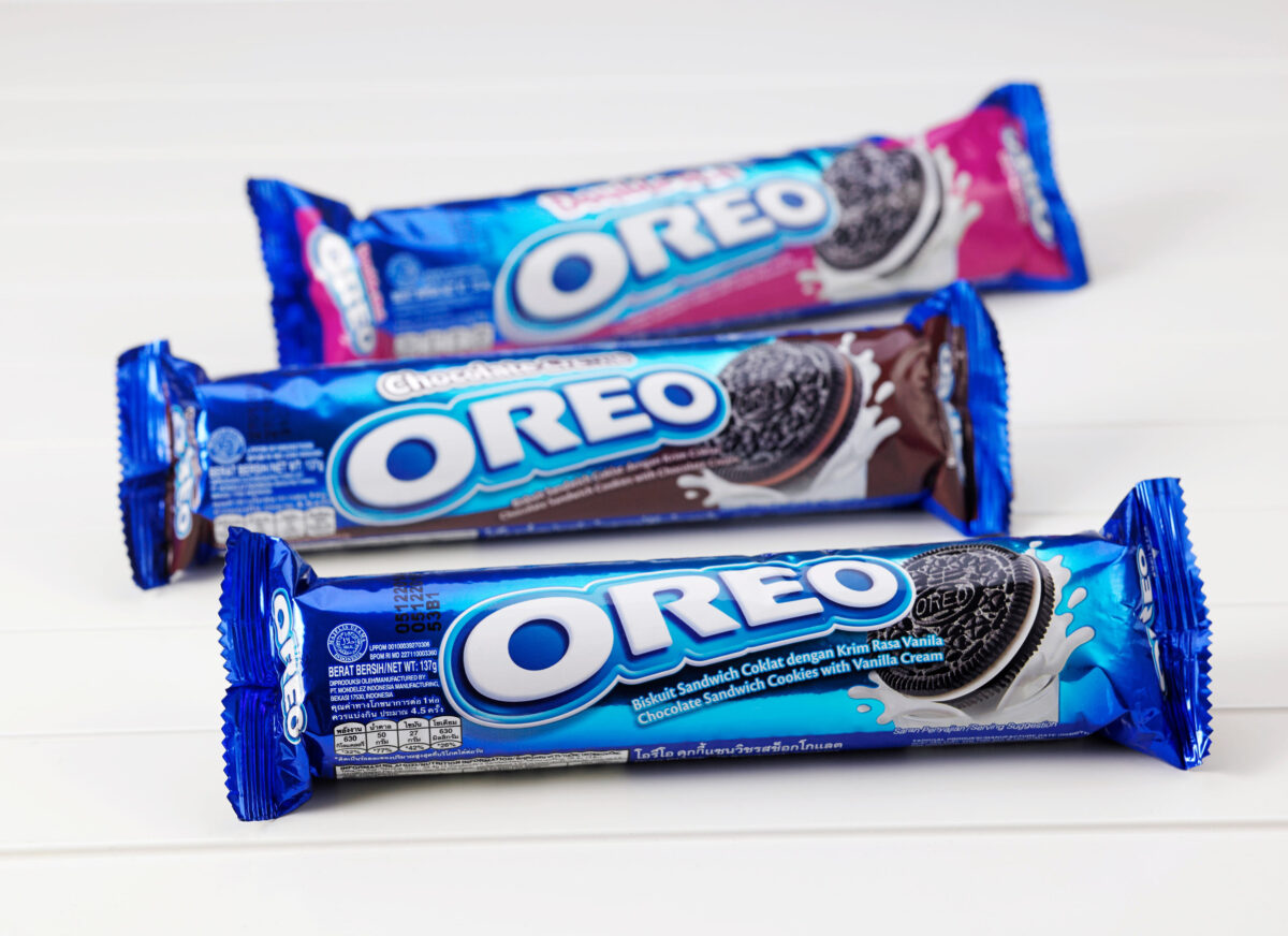
It’s hard to imagine buying Oreo cookies without seeing that familiar bright blue package. But when the famous sandwich cookie first appeared in 1912, its packaging looked considerably different.
The first Oreos were produced at a bakery in Manhattan’s Chelsea neighborhood and sold in bulk tins.
The company also displays a photograph of an early black-and-gold Oreo box, which looks strikingly different from the colorful packages found in supermarkets today.
Those early designs emphasized elegant lettering and a more formal presentation.
Over the decades, Oreo’s packaging became brighter, more playful, and easier to recognize.
Today’s blue wrappers prominently display the cookies and their cream filling, while special editions use different colors and graphics.
For anyone accustomed to grabbing a blue package from the cookie aisle, the original design is a fascinating reminder of how dramatically snack packaging has evolved.
Campbell’s Soup Started With Orange and Black Labels
Few food packages are as recognizable as Campbell’s red-and-white soup cans.
The design has become so familiar that it’s difficult to imagine the brand looking any other way.
However, Campbell’s first condensed soup labels in 1897 featured an orange-and-black color scheme, according to the company’s official history.
The famous red-and-white combination arrived in 1898.
The change was reportedly inspired by the uniforms worn by Cornell University’s football team, which impressed a Campbell executive attending a game.
Another familiar feature, the bronze medallion, appeared after Campbell’s received an award at the 1900 Paris Exposition.
While the brand has retained much of its classic identity, its labels have undergone several updates.
In 2021, Campbell’s introduced its first major condensed soup label redesign in approximately 50 years.
The newer packaging refined the typography and other details without abandoning its signature colors.
It’s a remarkable example of a food brand that transformed its original packaging but eventually developed a design too recognizable to replace completely.
Heinz Ketchup Was Sold in Traditional Glass Bottles
Today’s shoppers are accustomed to squeezing ketchup straight from an upside-down plastic bottle.
But Heinz ketchup once demanded a little more patience.
When the product first appeared in 1876, it was marketed as tomato catsup and sold in clear glass bottles.
According to a January 2026 report from Packaging Europe, Heinz chose transparent glass partly to display the product inside.
In 1889, the company introduced its distinctive eight-sided bottle, which was patented the following year.
The traditional glass design eventually became one of America’s most recognizable condiment containers.
However, getting ketchup out wasn’t always easy. Anyone who remembers tapping the bottom of a glass bottle knows the struggle.
Plastic squeeze bottles became part of Heinz’s packaging evolution during the 1980s, and the upside-down format later made serving considerably more convenient.
Today, the brand continues selling different packaging formats, including glass.
Still, the contrast between an antique Heinz bottle and a modern plastic squeeze container shows how convenience can influence package design.
Hershey’s Chocolate Bars Once Had White Wrappers
Imagine walking into a candy store and finding a Hershey’s chocolate bar wrapped in glossy white paper with gold lettering.
That’s what the original packaging looked like.
The first Hershey’s Milk Chocolate bar wrappers used white paper decorated with gold lettering.
The familiar maroon color appeared around 1902, although the lettering remained gold.
Later designs incorporated a sleeve-style wrapper that exposed foil at both ends.
Over time, the packaging moved toward the dark brown and contrasting lettering that customers recognize today.
Interestingly, Hershey’s began marketing its standard chocolate bars for five cents in 1900, a price that remained an industry benchmark for decades.
While the brand has maintained a relatively consistent identity for generations, its earliest wrappers looked noticeably more formal.
The original design feels closer to an old-fashioned confectionery shop than a modern supermarket candy aisle.
Related:15 Classic 1980s Foods EVERYONE Loved Back In The Day
Quaker Oats Had a Different Look Before Its Famous Round Container
For generations, the round Quaker Oats container has been a familiar sight in American kitchens.
But that iconic shape wasn’t always part of the brand’s identity.
Quaker’s history stretches back to the 19th century, when packaged breakfast cereals were still becoming established grocery products.
The company initially used other packaging formats, including rectangular boxes.
That packaging helped establish the recognizable pantry staple Americans still purchase today.
The brand’s early designs also featured different illustrations, lettering, and versions of the Quaker figure.
Modern packaging uses cleaner graphics and more prominent product information.
Interestingly, Quaker retained its traditional cylindrical container even as other food brands moved toward different shapes.
The product’s history shows that packaging doesn’t always need a complete reinvention to remain recognizable.
Sometimes, preserving one distinctive feature is enough to connect generations of shoppers.
Coca-Cola Originally Came in Straight-Sided Bottles
Coca-Cola’s famous curved glass bottle is so recognizable that many people assume it has always existed.
However, the company’s earliest bottled products appeared in straight-sided containers.
As competing soda brands entered the market, Coca-Cola wanted packaging customers could recognize at a glance.
In 1915, the company challenged glass manufacturers to develop a distinctive bottle.
The Root Glass Company in Terre Haute, Indiana, won the design contest.
Inspired by the shape of a cocoa pod, the design featured pronounced curves and vertical grooves.
The bottle entered production in 1916 and eventually became one of the world’s most recognizable beverage containers.
Today, Coca-Cola is available in plastic bottles, aluminum cans, and glass containers.
Modern packaging places greater emphasis on the company’s signature red branding, although the classic contour shape remains an important part of its identity.
Looking at the original straight-sided bottles, it’s almost surprising that they belonged to the same beverage company.
Trix Cereal Boxes Didn’t Originally Feature the Famous Rabbit
For many Americans, Trix cereal and its mischievous rabbit are practically inseparable.
But the famous mascot wasn’t part of the original packaging.
General Mills introduced Trix in 1954, initially offering colorful cereal pieces in three fruit-inspired varieties.
The Trix Rabbit didn’t appear until 1959, when he made his television debut.
Even then, the character wasn’t immediately featured on cereal boxes.
According to General Mills, the rabbit first appeared on Trix packaging in 1960.
Early versions looked different from the animated character familiar to generations of children.
The company experimented with different presentations, including a paper-mâché rabbit and a stuffed-animal version.
Eventually, the illustrated mascot became the brand’s face.
Modern Trix packaging features bright colors, playful graphics, and the rabbit prominently displayed.
Comparing a 1954 box with a modern version shows how powerful one cartoon character can be in shaping a food brand’s identity.
Pringles Once Featured a Very Different Mr. P
Pringles has always stood out because of its cylindrical container.
But while the can’s basic shape remains familiar, the face appearing on its packaging has undergone a remarkable transformation.
Early Pringles packages featured a detailed cartoon mascot with a prominent mustache, hair, and expressive facial features.
Over the years, the character became simpler.
In 2021, Pringles introduced a major redesign that gave its mascot a cleaner, more minimalist appearance.
The updated Mr. P features simplified facial details and a bold graphic style.
The redesign also refreshed the brand’s lettering and packaging presentation.
According to Design Week, the company worked with design agency Jones Knowles Ritchie on the updated identity.
For shoppers who remember Pringles packages from the 1970s or 1980s, the difference is immediately noticeable.
Yet the cylindrical container remains.
It’s another example of how a brand can completely update its visual personality while keeping the packaging feature that made it famous.
Why Vintage Food Packaging Still Fascinates Americans
Vintage food packages do more than show how graphic design has changed.
They capture memories of grocery shopping with parents, opening childhood lunchboxes, and discovering favorite snacks for the first time.
Some brands have traded ornate illustrations for simpler graphics. Others have replaced traditional materials with convenience-focused containers.
And a few, like Campbell’s and Quaker Oats, have preserved enough of their historic identities to remain instantly recognizable.
Perhaps that’s why vintage food packaging still attracts collectors and nostalgic shoppers.
A familiar logo or old-fashioned wrapper can transport someone back to a particular kitchen, neighborhood grocery store, or childhood afternoon.
Although today’s packaging may be more convenient, those older designs have a charm modern graphics don’t always capture.
Other Posts You Might Like:
8 Old-School Pantry Ingredients That Are Quietly Making a Comeback